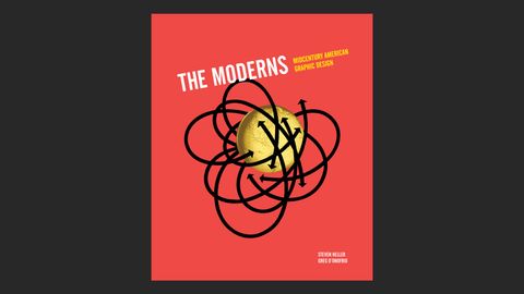
If there’s one graphic design book this month that’ll make designophiles swoon, it’s The Moderns: Midcentury American Graphic Design. With a hardback cover in look-at-me red and more than 300 colour illustrations, it’s a veritable behemoth of midcentury magnificence.
- Buy The Moderns: Midcentury American Graphic Design (UK): £40
- Buy The Moderns: Midcentury American Graphic Design (US): $45.65
Penned by Steven Heller (he’s clearly been very, very busy lately) and graphic designer and writer Greg Donofrio, the book takes the form of a series of profiles of around 60 key designers whose work across magazines, books, record cover, advertisements, posters, packaging and more shaped the contemporary graphic design landscape as we know it.

Refreshingly, the authors have been keen to make this not just another graphic design boys’ club: among the women designers that grace its pages are Lillian Bassman, Jacqueline S. Casey, Elaine Lustig Cohen and Tomoko Miho, among many others.
Naturally, these sit alongside the big guns: Josef Albers, Saul Bass, Lester Beall, Herb Lubalin, Paul Rand, Lance Wyman, and so on; as well as a number of names getting the recognition they deserve for the first time.

Many of the designers featured in The Moderns emerged during the postwar period that shook the world in every sense, but for them, this manifested through visuals. “Modern” design, for them, symbolised a severing of ties from the greyer, Depression-era world their parents inhabited; it heralded a brighter (often literally) new movement where graphic design was becoming a bold, artful, and frequently conceptually based force to be reckoned with.
What’s so deliciously striking while flicking through the pages of The Moderns is the breadth of the work, and the unanimous sense of innovation and experimentation, even in work for the most apparently straight-laced clients.
As the book’s introduction points out, Modernism is a vast and loose concept, one “composed of disparate movements” from the early to mid-20th century that “shared the same philosophical and aesthetic currency.”

But what was that philosophy? “... dissatisfaction, even disgust, with the antiquated ideas about art and design.” In that sense, it was a sort of punk-like drive for newness in the face of staleness; but without any sense of nihilism.
Instead, graphic design was being used to drive and create a new approach to aesthetics that suddenly placed graphics in a sense of wider societal and cultural concerns. These were the designers that realised that the visual was all part of a far wider tapestry – they understood the power of graphic design, and its capacity for not only sales or persuasion, but for good, and for freedom.
- Buy The Moderns: Midcentury American Graphic Design (UK): £40
- Buy The Moderns: Midcentury American Graphic Design (US): $45.65
Related articles:


