It's impossible to escape seeing logos everywhere you go, but some of the most iconic brand emblems have a little more to them than meets the eye. And as we love a good 'logo secret', we've assembled some of our favourites for you, so you can get your fix all in one place (you're welcome).
If you get to the end of our list and feel inspired to create your very own design, then beginners might want to look at best free logo makers to get started, while designers of all levels might appreciate our top tips on how to design a logo. In the meantime, here are the secrets behind 5 well-known logos.
01. Tesla

It's pretty obvious that the Tesla logo looks like the letter 'T', right? Well, it reminds some folk of an IUD. And it was that comparison that led Tesla CEO Elon Musk to reveal the real Tesla logo secret in a bid to clear up the confusion.
He claims that the T shape was actually chosen to represent the cross-section of the Tesla engine. Hmm, Tesla is known for its design Easter eggs, but we're sorry, Elon. It looks more like an IUD and that's what we'll always see in the Tesla logo now.
02. Walmart
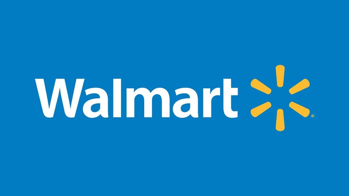
You'd be forgiven for thinking that the Walmart logo resembles something along the lines of a flower or a sun (I mean it looks exactly like a badly drawn flower or sun). However, back in February, we were amazed to discover that the Walmart logo is neither of the above.
According to the official Walmart blog (yes, there's an official Walmart blog), the logo actually resembles a spark. Specifically speaking, the "spark of inspiration that led Sam Walton to open the first Walmart". But the fun doesn't stop there – the six 'sparklets' are each supposed to represent something: the customer, respect, integrity, associates, service and excellence. Okay then. I suppose it's a neat way of creating a visual pneumonic for staff induction sessions.
03. Bluetooth
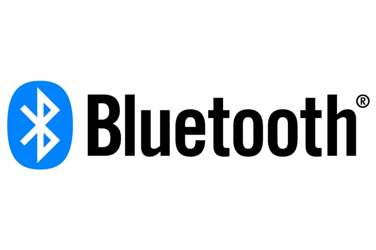
The Bluetooth logo has become one of the most famous designs of the 21st century. After all, we all have it on our phones and computers. But did you know that the logo is far more than just a particularly spiky-looking letter B? In fact, the Bluetooth logo has links all the way back to the Vikings.
The logo design is actually a combination of the Nordic letters 'H' and 'B' - which stand for Harald 'Bluetooth' Gormsson. Gormsoon was a Viking who gained his 'Bluetooth' nickname after one of his teeth went black. Apparently, the engineers behind the revolutionary tech were inspired by the story of the Viking, thus Bluetooth was born.
04. Twix
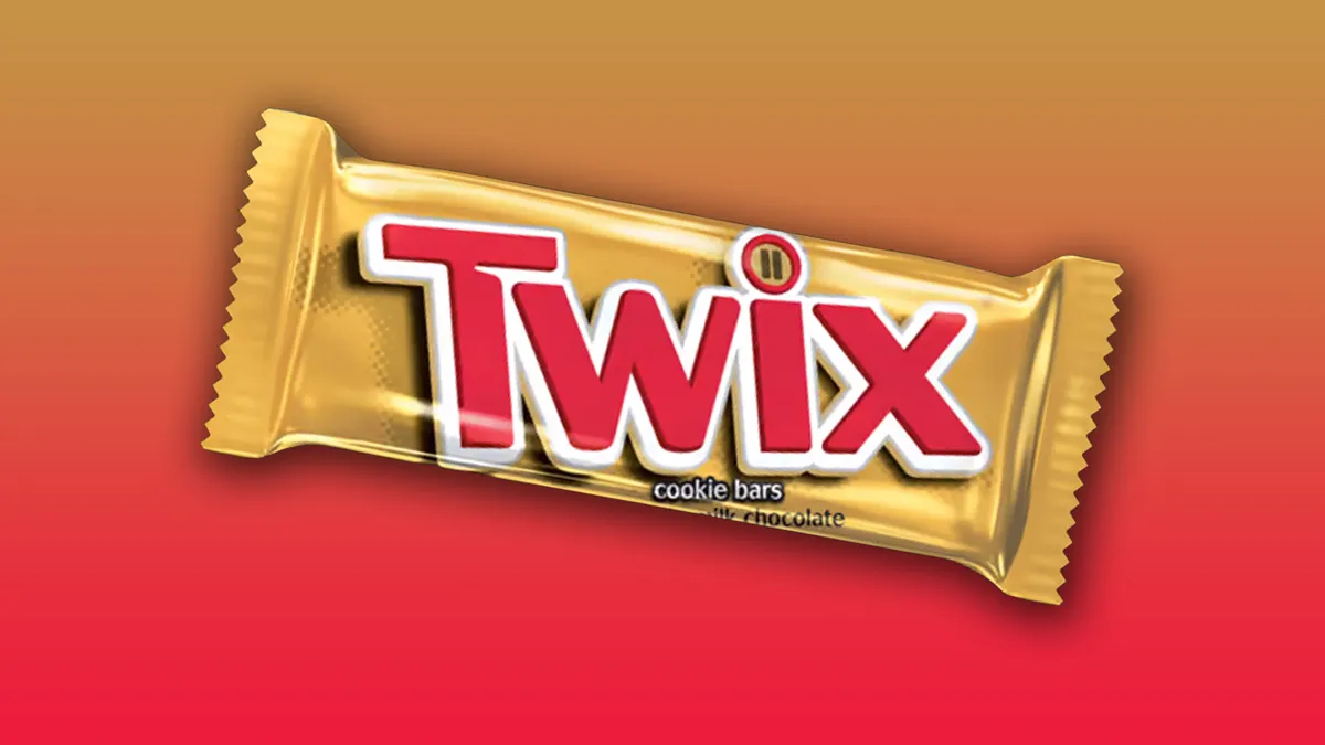
Ah, the Twix logo. It consists of bright red lettering and mini Twix bars in the dot of the 'i', right? Well, you might think that you have the famous chocolate bar logo all sussed out, but those teeny-weeny little bars in the eye have a double meaning.
While the two bars represent the chocolate you get in a standard Twix packet, they also resemble a pause sign. The chocolate bar's previous ad campaigns revolved around the slogan, "Twix, need a moment?" which is what the pause sign is referring to on the packet. Not to be confused with, "Have a break, have a Kit-Kat," of course.
05. Starbucks

We're all familiar with the Starbucks mermaid, (she's on every corner, after all). The mystical logo has gone through some transformations over the years, but back in 2011, she got a makeover that went by as a little-known Starbucks logo secret.
If you look closely at the mermaid's face, then you can see that it is slightly asymmetrical. Apparently, this little detail was designed to make the siren's face far more human and approachable. The imperfection in the logo also serves to add a bit of intrigue and legend to the logo – well, the brand is named after a character in Moby Dick.
Read More: