The best circular logos are among some of the most recognisable brand identities, and there are several reasons why. The circle is a satisfyingly pure and simple geometric shape, and circles are found everywhere in nature, including in the sky in the form of the moon, sun and planets. They often convey a sense of solidity, calm, harmony and trust.
Circular logos can also be used to echo the physical properties of a product, in a minimal, 2D way. For example, a circle can look like a button, a pin, a tin or even headphones. Circles also tend to work well as a framing device for letters, text or icons, adding a sense of balance to logo designs. Below, we point to some famous examples of circular logos, and explain how they came into being and why they work (see our guide to how to design a logo for more tips).
01. The Pepsi logo
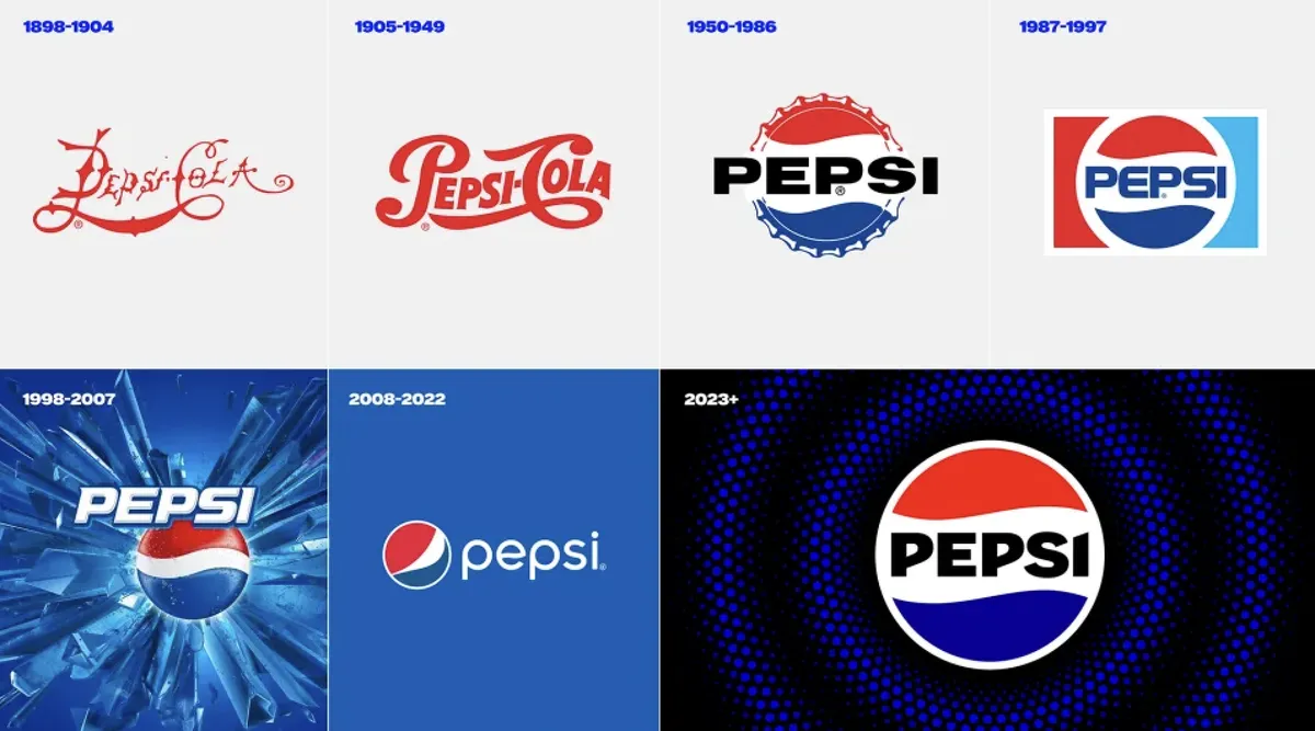
Coke may be the world's biggest-selling soft drink, but Pepsi has done pretty well over the years too. And its simple, classic, circular logo is nothing short of iconic. First launched in 1893 as "Brad's Drink", the beverage became Pepsi-Cola in 1903, originally marketed as a digestive aid. Its original logo was based on script lettering, not unlike its main rival, but in 1940, it put the wordmark on the bottle cap, along with distinctive red, white and blue colouring. That would create a logo that remains instantly recognisable today.
It's no accident that the wavy stripes are the colours of the US flag: they were chosen to show support for the troops in the Second World War, but in the process, the company's CEO unwittingly created what would become the Pepsi logo. A picture of the bottle cap itself was used as the logo design in 1972, and this then morphed into a pure geometric circle in the 1973 version.
The Pepsi logo has seen a few modifications since, with the text taken out of the circle in the 1990s, and the circle itself redesigned to look like a smile in 2008 (a move presented in the most ridiculous logo design manual we've ever seen). However, in 2023, Pepsi went full circle as it were, taking inspiration from its classic logo design.
02. LG logo

LG also redesigned its logo in 2023, but it also stuck with the circular logo shape. It slimmed the design down and made it flatter, which makes it look more modern and youthful and allows for it to be animated (see our pick of the best animated logos).
The Korean conglomerate Lucky-Goldstar (LG) was born when Lak Hui (pronounced 'Lucky') Chemical Industrial Corp merged with Goldstar Electronics in 1983. The circular logo was created in 1995, combining the letters LG – which as well as being the company name also served as an abbreviation of its slogan 'Life's Good' – in a way that resembled a winking, happy face, but also felt like a button you might expect to see on an electronic device.
That's a lot of different boxes to tick, and overly clever logos like this can often be off-putting. But somehow, in the case of LG's logo, it all works together in perfect harmony. Few things in life are more likely to generate an emotional reaction than a smiling face, even if you don't subconsciously register it. So it's not surprising this sleek logo has stood the test of time.
03. HP logo

Another electronics company making great use of a circular logo, HP Inc. was founded when the personal computer and printer arm of Hewlett-Packard split off in 2015 to form a separate company.
HP's circular logo dates back to 1946, when it was first created to represent Hewlett-Packard as a simple line drawing. In later redesigns (1979 and 1999), the circle was enclosed in a rectangular box with curved corners, before returning to a purely circular design in 2008.
HP Inc. also released a radically minimalist logo in 2016 for its premium products only. But although it's a nice gimmick, we can't ever see this logo taking over the main one, because the traditional circular logo just seems so warm and familiar, not to mention infinitely scalable, whatever your screen size.
04. Nivea logo

Founded in 1882 by the pharmacist Carl Paul Beiersdorf, NIVEA is a global skin and body care brand based in Germany. Its best-known product, Nivea Crème, was first packaged in the distinctive blue tin in 1925, and since a 2013 redesign, the logo has been encircled a circle that reflects the shape of these iconic tins.
It turned out to be a very smart move: the circular logo both looks great and evokes a sense of nostalgia in people who've been using Nivea throughout their lives.
05. USA Today logo

Wolff Olins caused controversy with its 2012 rebrand of USA Today, by stepping away from the traditional approach to newspaper design. The core of the rebrand was based around a large, flat-colour blue circle; a super-minimal rendition of the previous globe graphic.
This was well in keeping with the app-driven trend throughout the 2010s to flatten, simplify and minimalise logos and visual identities. But at the time, the new look drew tremendous ire from readers more accustomed to fussy and ornate typographical treatments in their newspaper mastheads.
In retrospect, though, the circular logo holds up well years on. As well as making the brand look modern and up-to-date, it's also versatile, with the circle acting as a container device for content, and appearing in different colours to identify various sections of the paper.
06. Target logo

If simplicity is the goal, you can't get a much more successful circular logo design than Target's. The US retail brand's name is reflected perfectly in the bullseye-style graphic, and it tells a subconscious story to consumers too; that this store is perfectly targeted towards your shopping needs.
This deceptively sophisticated logo was first created in 1962, streamlined in 2006 and is now one of the most recognised symbols in North America, whether it appears with or without its accompanying wordmark.
07. BMW logo

While the Pepsi logo was inspired by bottle caps, and Nivea's by its tins, the famed BMW logo is said to have been inspired by an aeroplane propeller. That's because the car company began life as an aircraft engine manufacturer, which produced aircraft engines for the German Air Force, the Luftwaffe.
It's a lovely story, but as we revealed in this post, it's sadly not true. The fact that the circle is divided into quarters is to reflect the Bavarian flag. That doesn't stop it being one of the world's most recognisable and loved logos, of course. So much so, we could ultimately see the brand dropping the letters altogether, as it would still be easily recognisable.
The most recent redesign saw BMW flatten the logo, following the general trend towards simplified logo designs, removing the gradient and making the outer circle transparent. We rated the clean result among the best car logo redesigns we've seen
08. Pinterest logo

Launched in 2010, Pinterest became one of the internet's biggest brands, by serving as a virtual pinboard for people's favourite images. It wasn't the easiest concept to convey visually, so the platform struck gold with their logo, based around a 'P' icon – which transforms the first letter of its name into a pin.
Combined with the phrase 'Pin it', this emblem makes it instantly clear what it is you're supposed to do, and it's not surprising it's remained largely unchanged since. (The 2017 redesign made the lettering more business-like but left the emblem well alone.)
09. Starbucks logo

Founded in Seattle in 1971, Starbuck's went on to populate the world with its high-priced coffee shops. Why would people agree to pay above the odds for a drink they could get cheaper elsewhere? There are a lot of factors, but one of them is branding, and the logo is an important part of that.
Because the company was named after Captain Ahab's first mate in Moby Dick, the original logo design was based a 16th-century Norse woodcut of a two-tailed mermaid. The design has been through many changes since then, but its essence remains, and it's become so recognisable that the need for words like 'Starbucks' and 'coffee' has melted away; nowadays the emblem alone can do all that work and more.
10. Beats by Dr Dre logo

The world’s hippest headphone brand, the logo for Beats by Dr Dre is the most modern on our list, and yet another example of how circles can be used to signify the product itself.
Produced in collaboration with California's Ammunition, the logo encases the 'b' inside a circle, creating a "hidden symbol": the head of a person (the red circle) wearing one of the headphones (the white ‘b’). If you notice the trick, then it makes you smile. If you don't, you haven't lost anything; it still works as a great logo all the same.
11. Firefox logo

One of the beautiful things about shape in logos is that it allows you to connect related brands into a family. Of course, this can be done by other means too, most commonly colour. Using colour can have its downsides though – we've seen users complain that they find it hard to find the Google app they want because the icons all have the same Google colours. Mozilla's circular logo for its Firefox browser has a recognisable shape, and it was able to replicate that for the new logo for its Thunderbird email service, making a clear visual link between the two.
12. Timberland logo

Many circular logos work well because they're so simple, which aids recognition and memorability. But they don't necessarily need to be super simple. The Timberland tree is relatively complex in the number of lines it has forming the tree branches and the undulating terrain, but the logo is instantly recognisable and it references the clothing brand's name and focus on rugged outdoor wear. The fact that its a circle helps contain the logo and give it balance.